While working at Pluxbox as a Product and UX designer I have had the opportunity to participate in complex projects for NPO (The Dutch public broadcaster), HVA (Hogeschool van Amsterdam) and GNR (GROOT NIEUWS RADIO) where I have been able to contribute my vision and skills as a designer.
Let me show you one of the most complex projects I've been working on for NPO where I've developed complex dashboards, web app.
I was equally comfortable building a product from scratch and user testing, as well as supporting existing products with tasks such as UX research, user testing, and personas. I worked closely with developers to ensure design consistency and exceptional user experience.
Nederlandse Publieke Omroep (in English, "Dutch Public Broadcasting"), also known by its acronym NPO, is the public broadcasting company of the Netherlands.
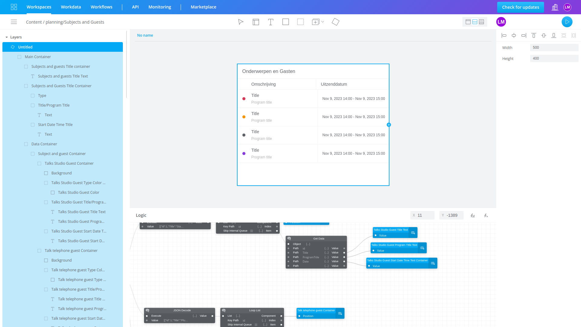
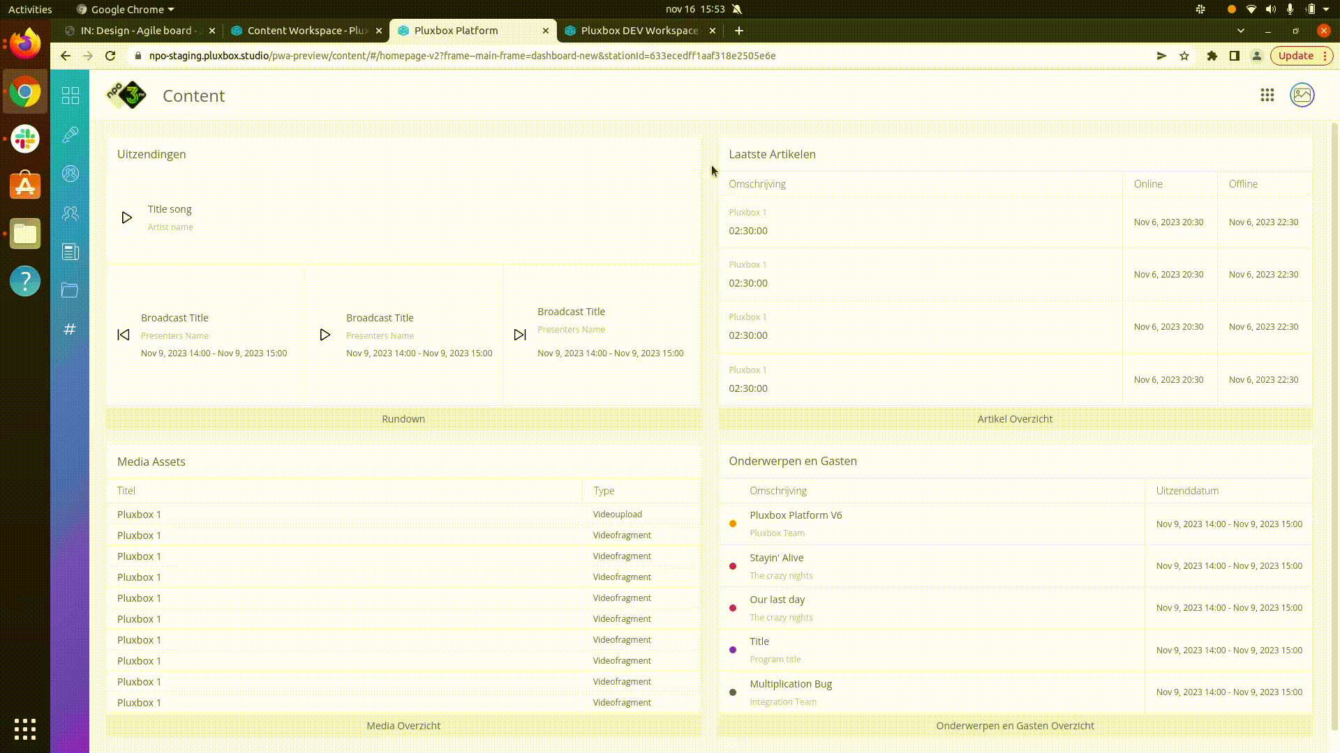
Inside NPO - Content we can find a dashboard, rundown, subjects and guests, contacts, articles, media and social overviews.
The design of this dashboard has been complex due to the different functions:
Inside rundown.
Show the song that is currently playing. Previous, current and next broadcast and button to the overview.
Inside last article.
Show last 10 articles created in order of creation and button to the overview.
Inside media assets:
Show the last 10 created and the type (video, audio, videofragment, audiofragment) and button to the overview
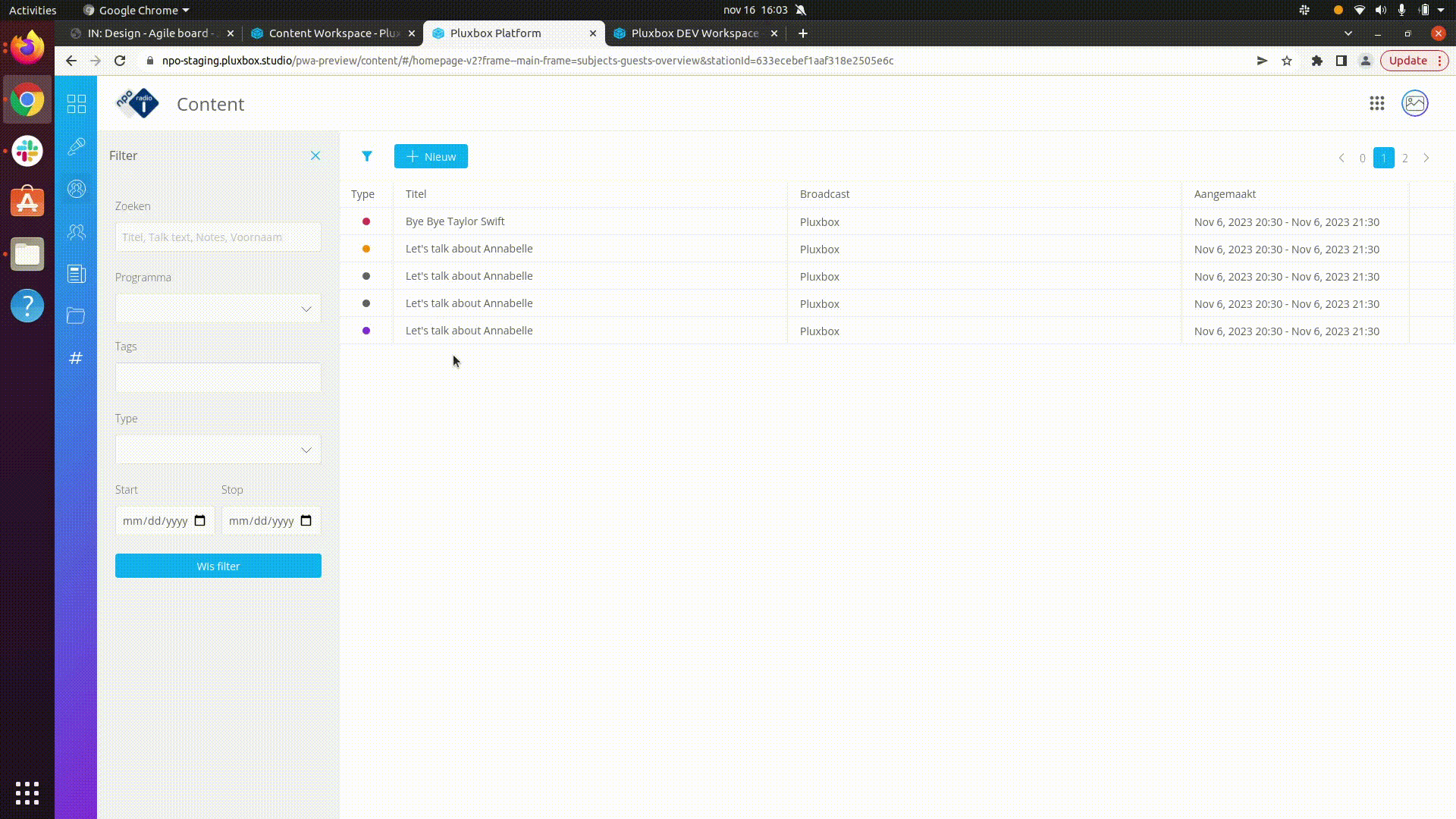
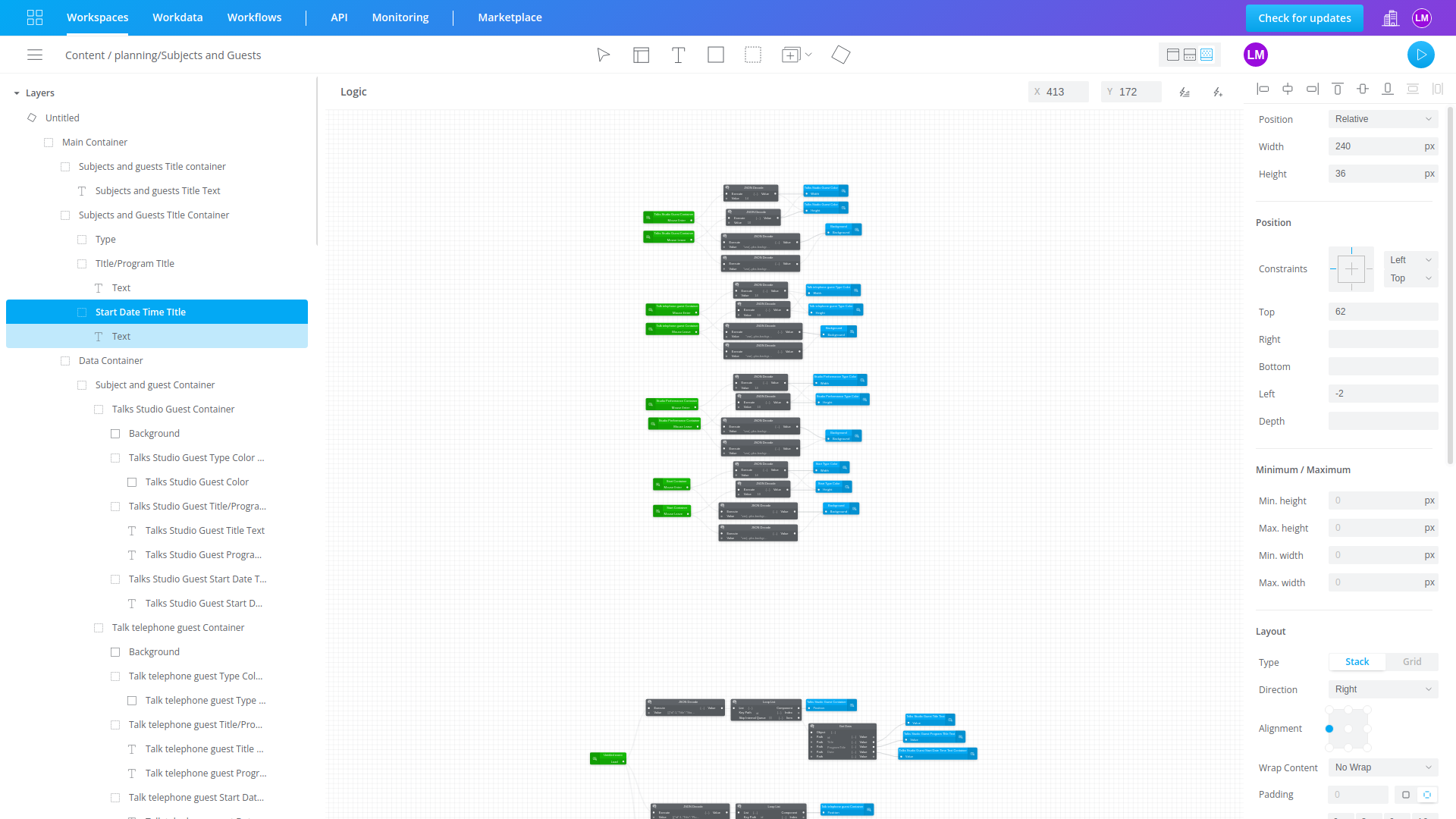
Inside subjects and guests:
Show last 10 created and sorted by type and color and button to the overview
Inside the rundown we can find different types of broadcast and create them and add the details.
.gif)
In subjects and guests we can find a list of broadcast creation and it's details, be able to create a new one and filter by title, programa, tags, type and date.
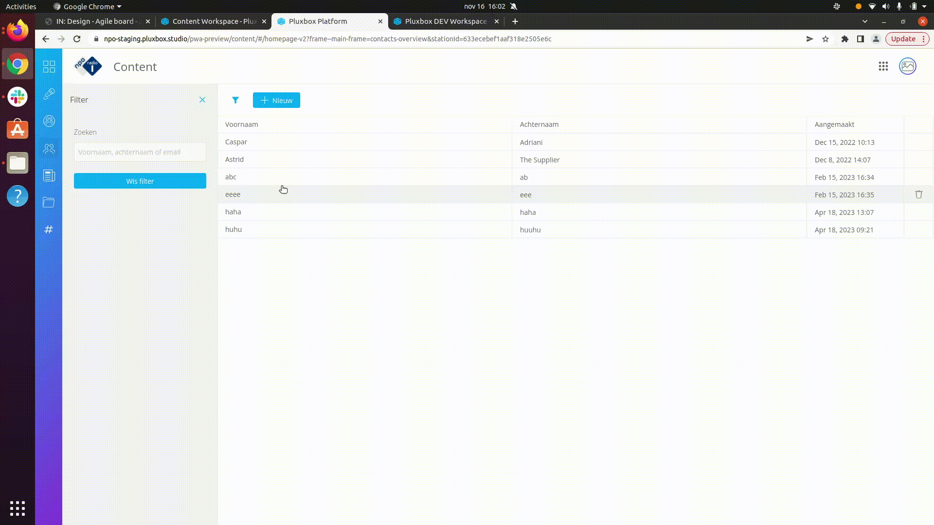
Inside contacts we can see the contacts created and the possibility of creating new ones and deleting them, as well as the possibility of filtering by name and last name.
Inside the articles you can see a list of the articles created in order of creation date and the possibility to create and view their details.
.gif)
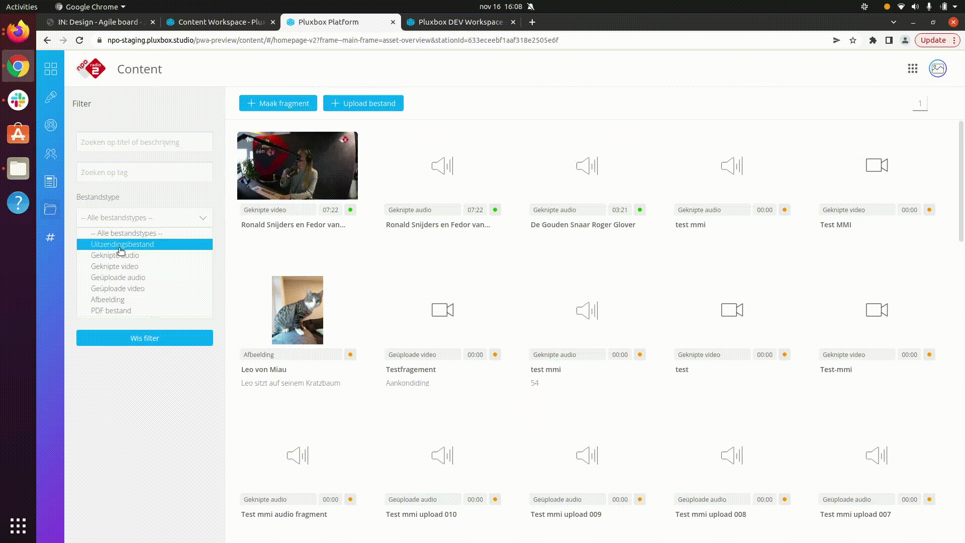
Inside the media you can see all the audios, videos that it has and you can filter them by title, tags, type, and date-hour.
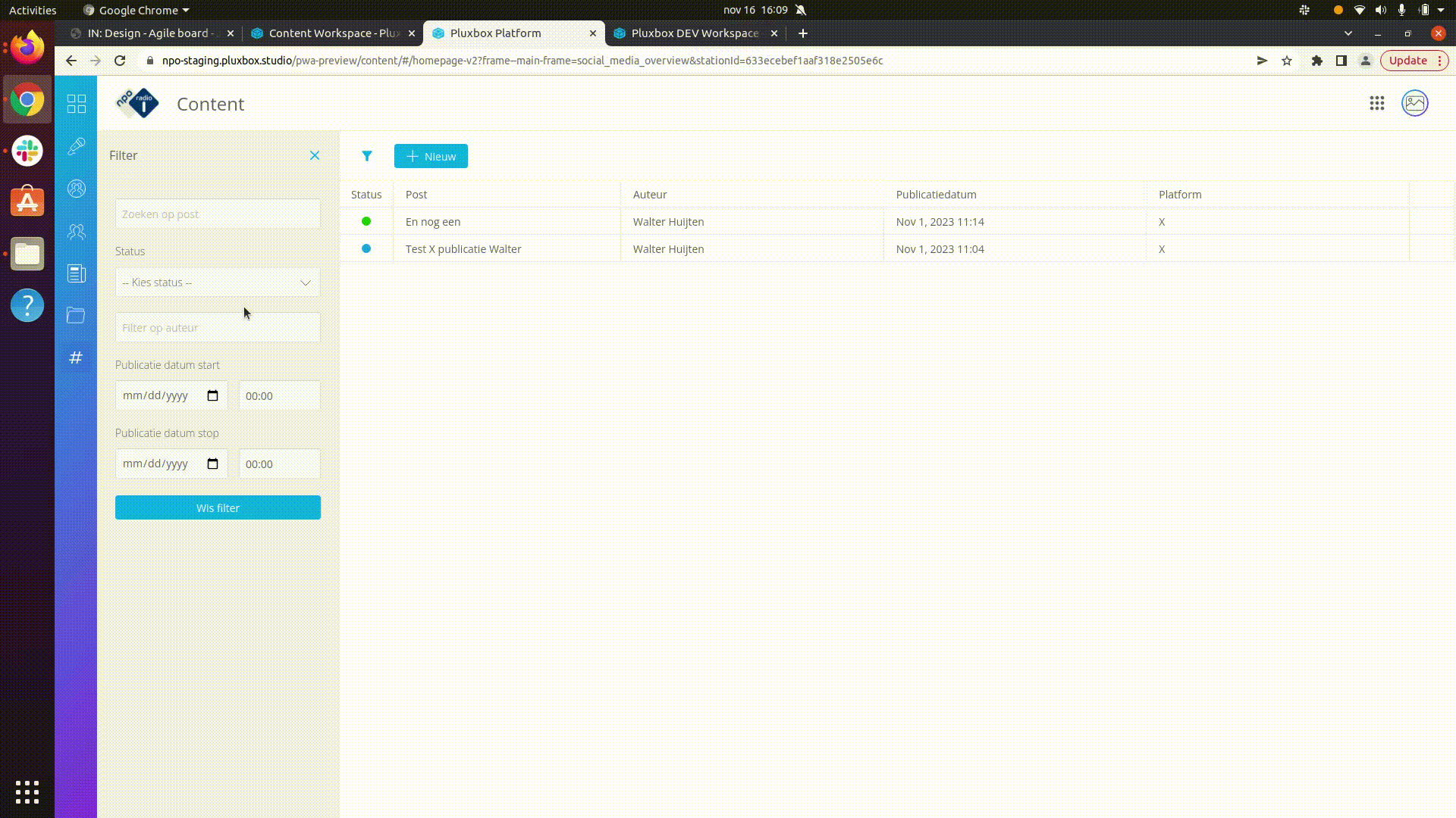
Inside the social you can see posts created through the social network "X", also, you can filter by title, status, autor and date-hour.
Reducing eye strain and improving the aesthetics of an interface, dark mode can also have significant accessibility benefits


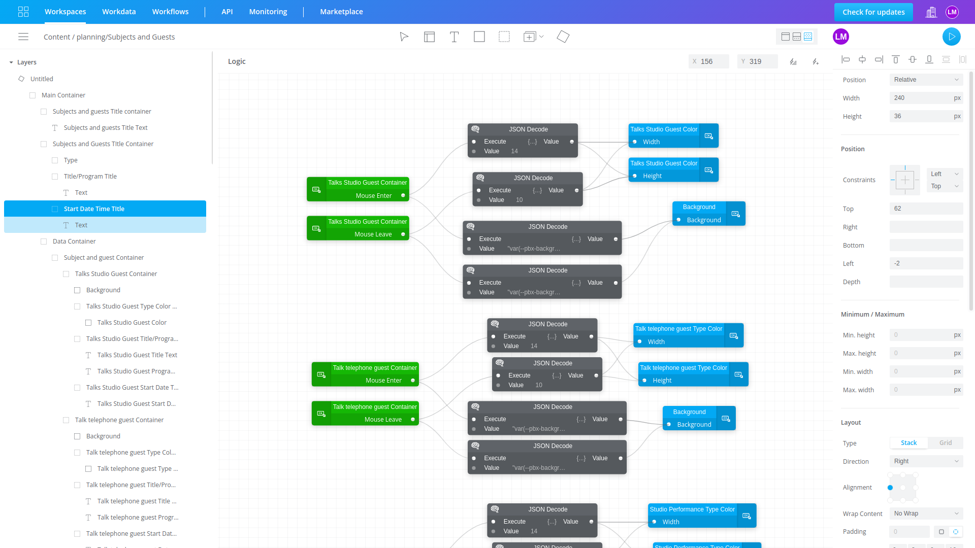
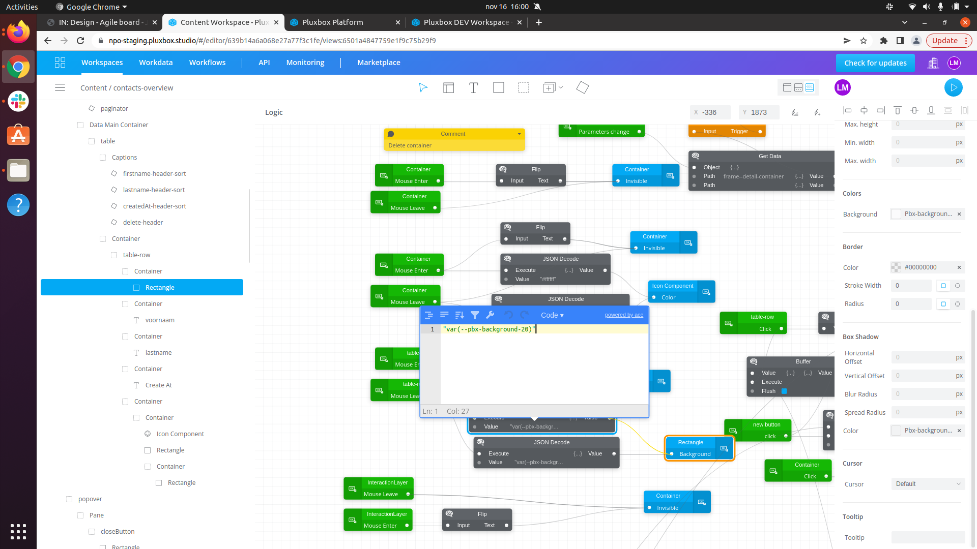
The design system of this project is big and ambitious, you can see some of the most " complicated" that I developed using the nocode (blueprint) technology.
You can see the interaction to change colors, sizes and fonts when hovering.
This is a major project, which has had to make difficult and risky decisions, but it has been a successful project.
Thanks to my creativity and previous knowledge I have been able to learn and develop professionally in the ¨nocode¨ world and being part of the conceptualization, strategy and planning of the final design has allowed the project to have an aesthetically and functional direction, achieving a great impact to the user and its purpose.