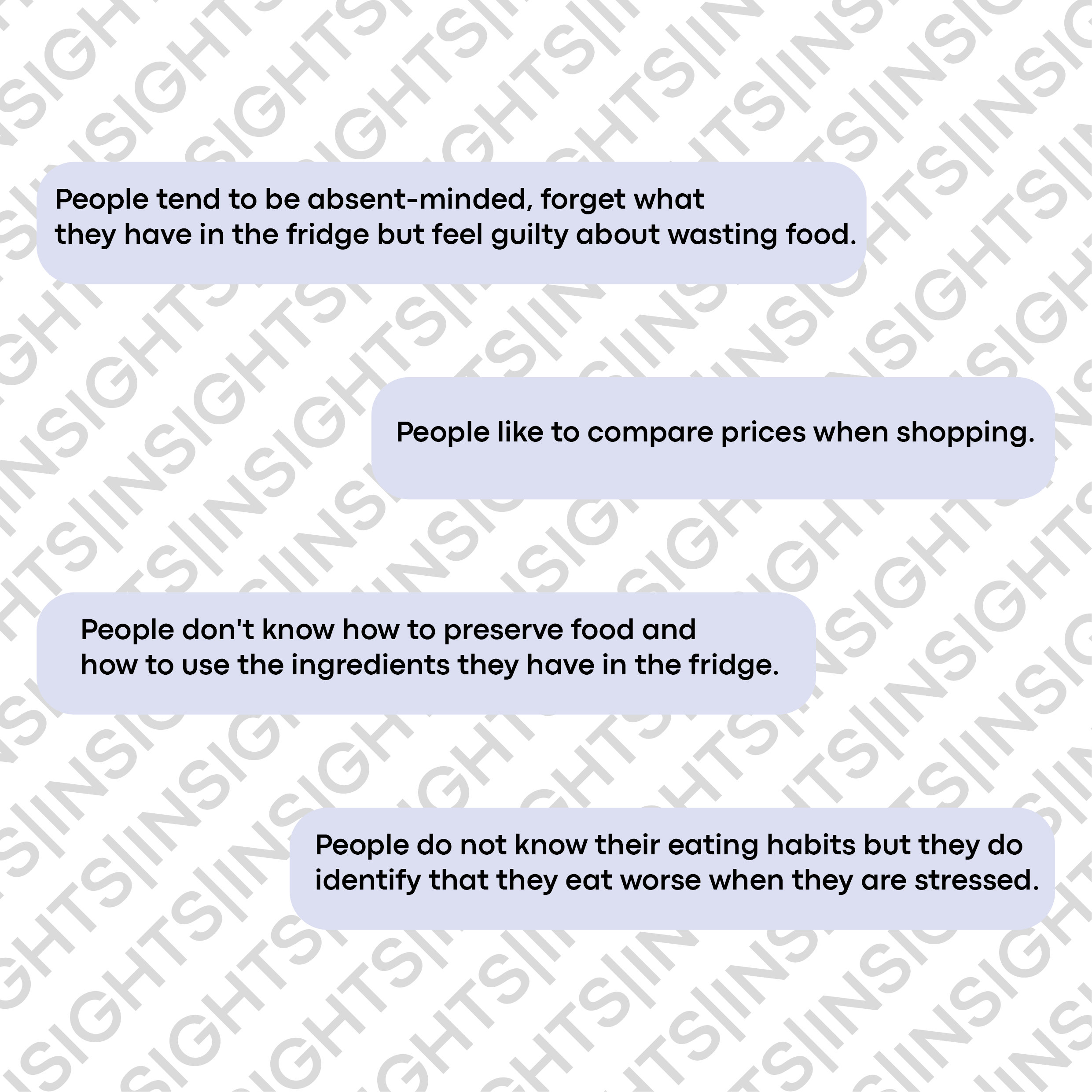
Each person throws 31 kg of food in the trash per year. This data had an impact on the realization of this project, therefore, we conducted a deeper study of its causes, which we must emphasize is that our consumption habits are conditioned by stress, haste, advertising impacts.
Zero Waste is a service that actively raises awareness among users about food waste, helping to reduce food waste and making the user feel part of a new community.
The app will feature: reminders about the food you have and when it expires, tips on food preservation, recipes of food that users have in their homes, add food and purchase tickets thanks to the camera of the devices (mobile) and management of shopping lists.
My team was in charge of creating all the phases of this project, translating what we had in mind. The most important goal was to create a tool to be used daily and comfortably, being versatile, intuitive, educational and above all to avoid food waste.
We looked for information about food waste and causes of food waste in order to gain insights and know where to go, as well as to see what had been done about this problem.
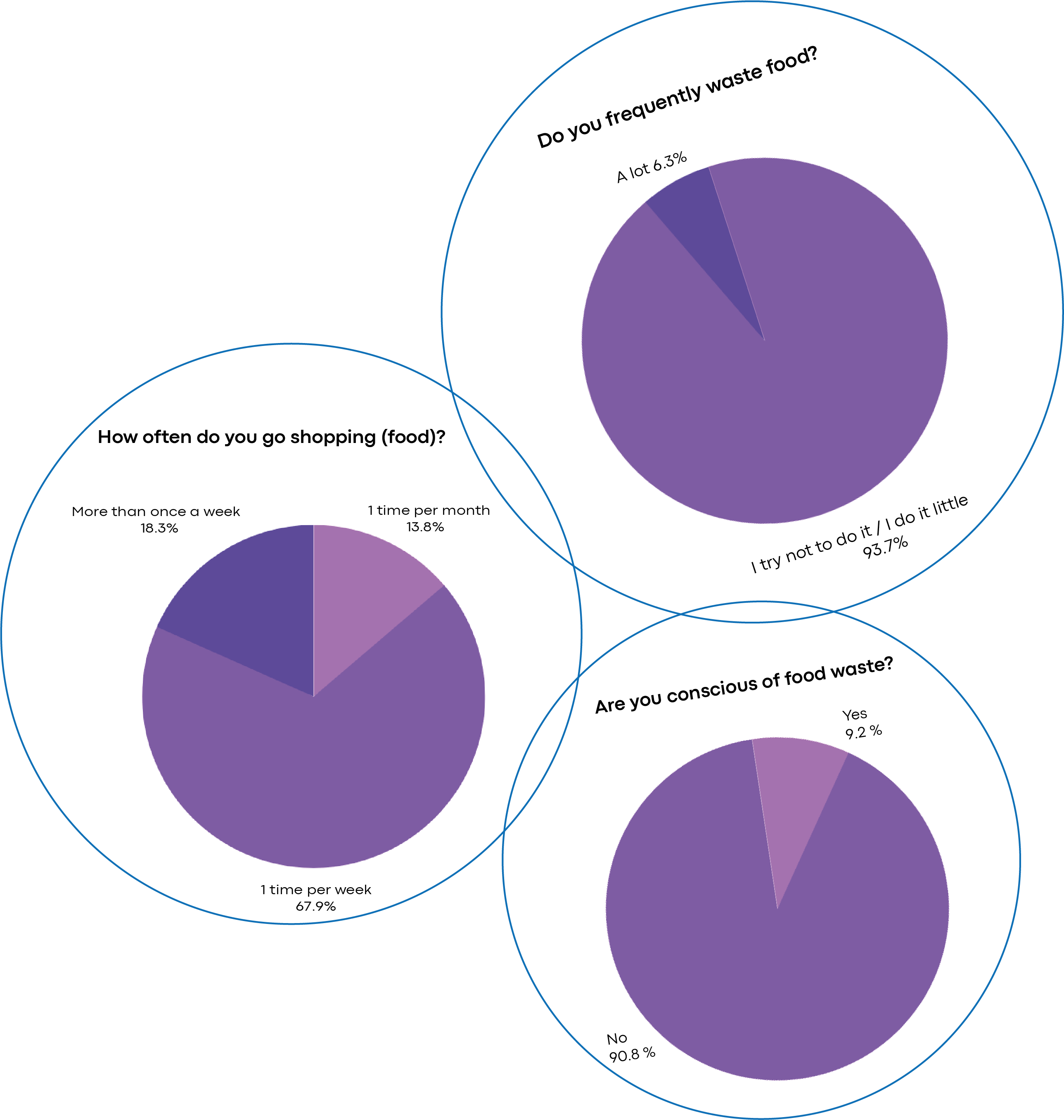
We interviewed several people with different age ranges (18-50) and we concluded:
They prepare a shopping list.
They don't know what to do with some foods.
They forget what food they have in their homes.
We define several user personas to finally choose our ideal customer who was Alicia García.
We define the interactions and processes that the user has when making the purchase, observing the pain points and new market niches.
In the value proposition canvas we define the pitch, the impact for the business, its functionalities, attributes, values and the impact for the user.

In the lean canvas we defined the most favorable and necessary points for the creation of our project, although they have been changing as the project has progressed, requiring more needs and eliminating others.

We define what would be the most important points that our project should have.
We made a sitemap to be able to have clear which would be the main screens and the levels that our application will have, obtaining as a result a more efficient way to track the sites and to know in every moment where we are and what level we are working.
A design system is a collection of reusable components that allows us to work in an aligned way through a common language.
We have detailed best practices for adopting atomic design so that it can be efficient.
Understandable: Providing readability as well as predictable in appearance and operation.
Consistent: Necessary to point it in a single direction.
Simple: We wanted a clean and homogeneous look and feel.
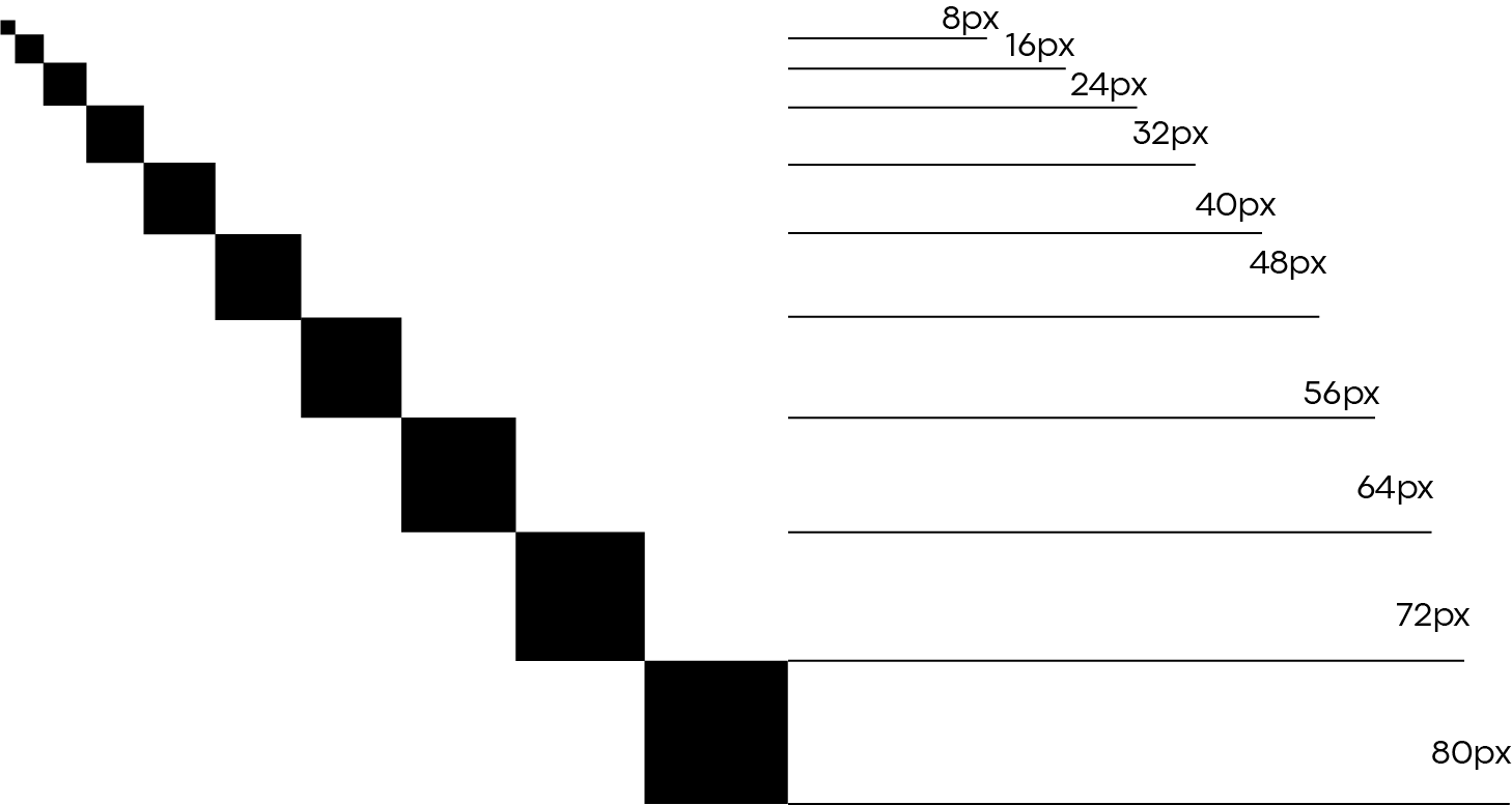
We chose 8px grid rules to spread out the components and build a system that is adaptable, scalable, and stable. Utilizing number like 8 to size and space elements makes scaling for a wide variety of devices easy and consistent.
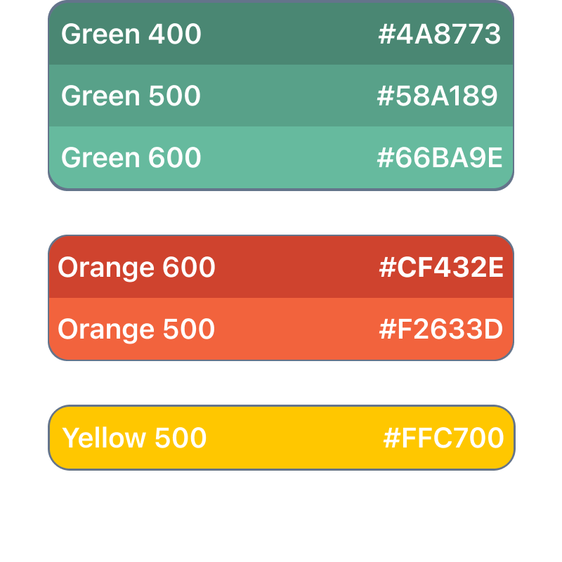
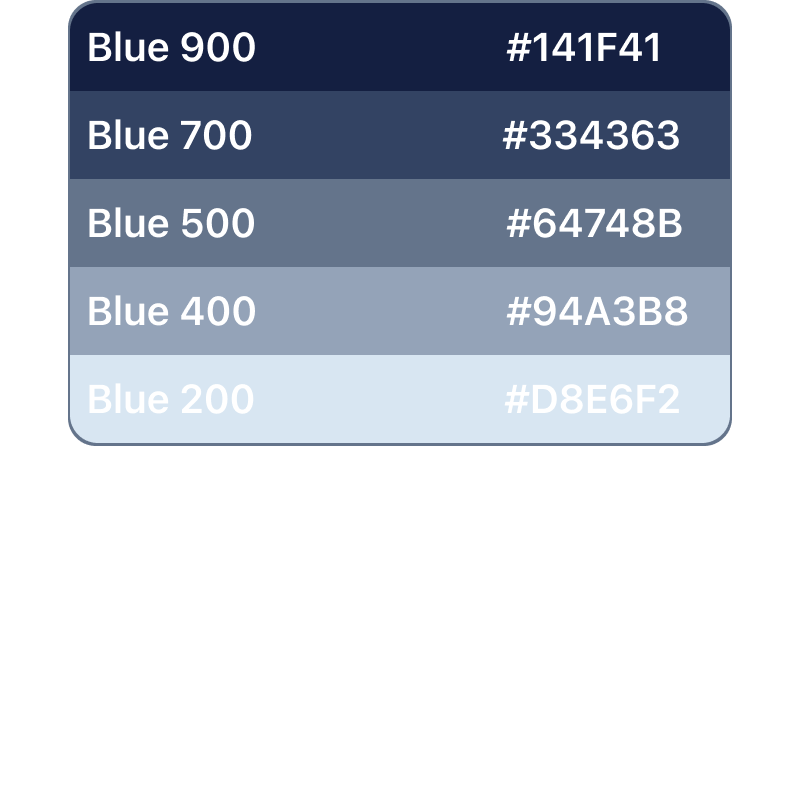
Because we were looking for an application related to sustainability and the environment we had to choose our color palette well and be in line with our concept.
Neutrals, border colors and text were used for project elements.
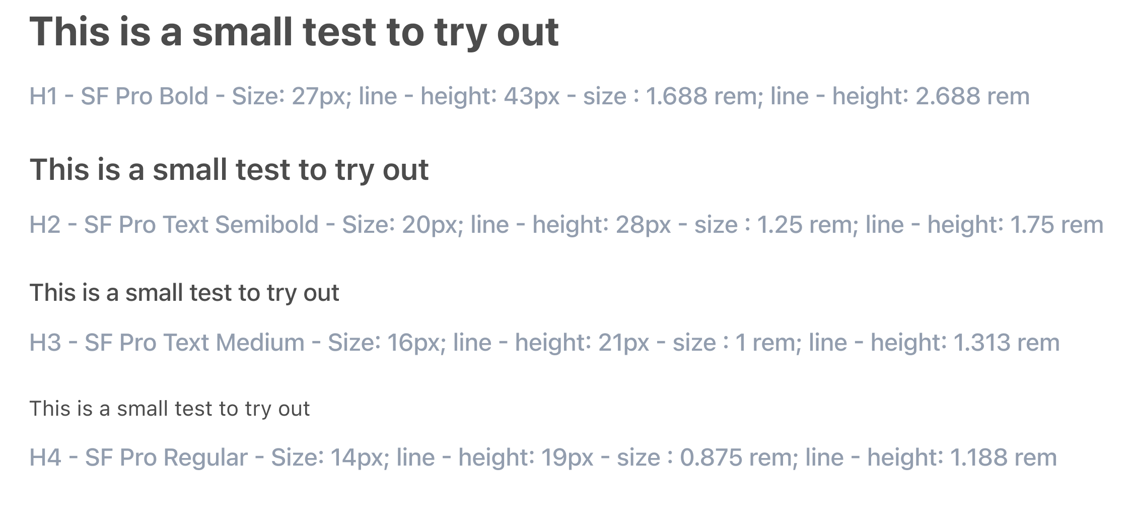
Our group used a single typeface San Francisco Pro.
We used classic iconography, very identifiable and legible.
So we chose a library that fit our needs and aesthetics and produced some more internally.
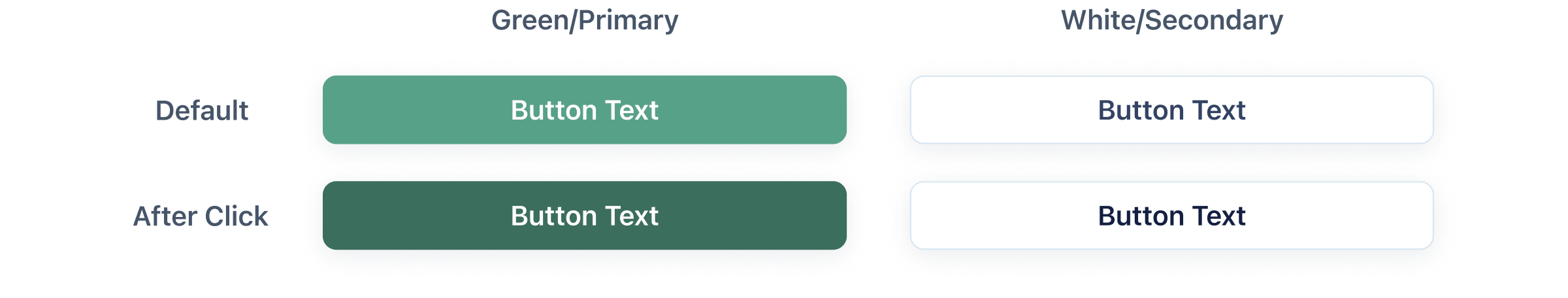
For our clickable components, we built a Two-level hierarchy
Atomic Design is a methodology inspired by chemistry (originally created by Brand Frost). Just like how all matter is made out of atoms that combine to form molecules, which then make up more complex organisms.
Atoms are the foundational building blocks eg. Icons, Colours, Typeface styles…
Molecules are simple groups of UI elements eg. Buttons, Dropdowns, Alerts…
Organisms are more complex components that form sections of an interface. eg. Navigation, footer, card modules...
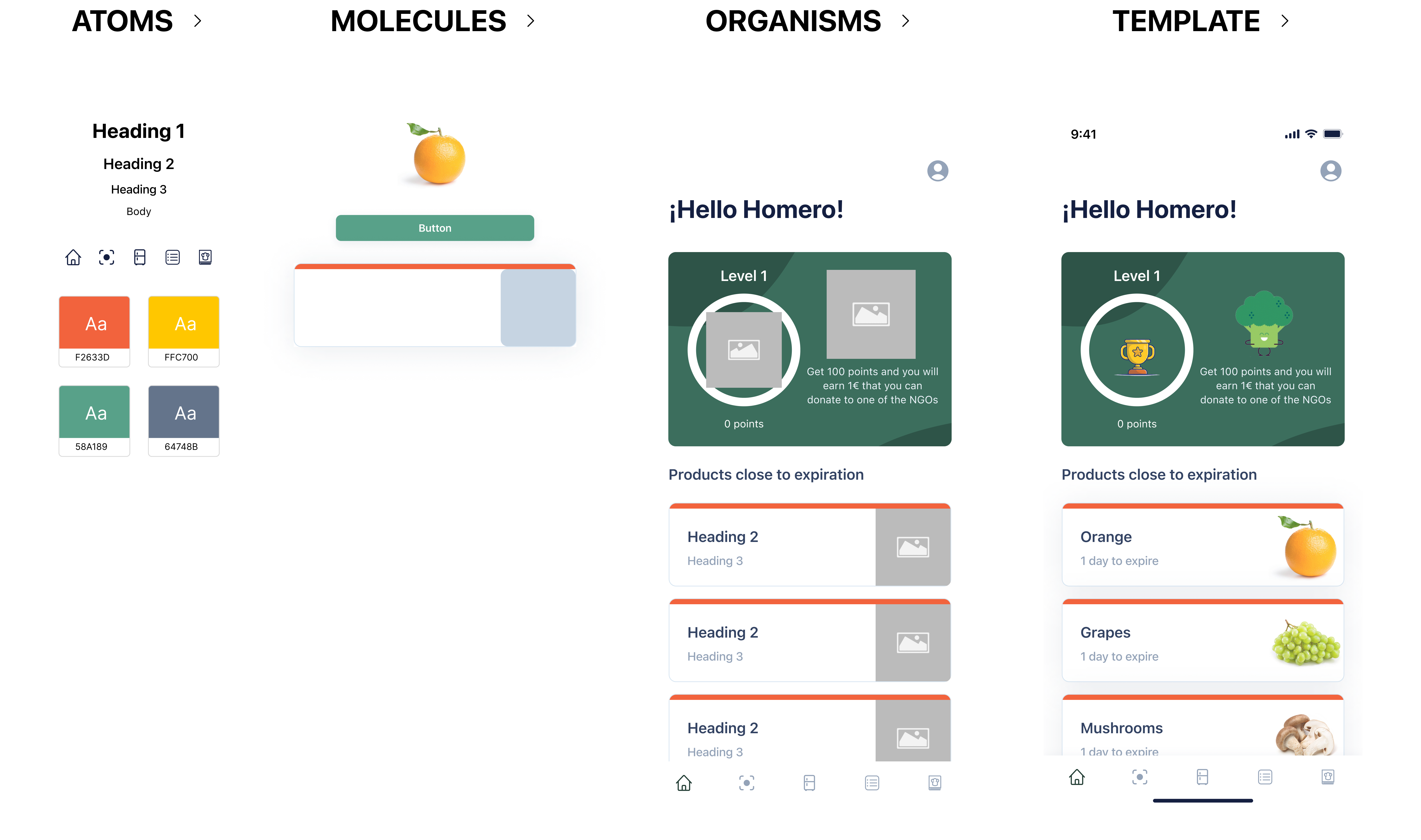
We can observe more atoms, molecules and organisms that make up our project.
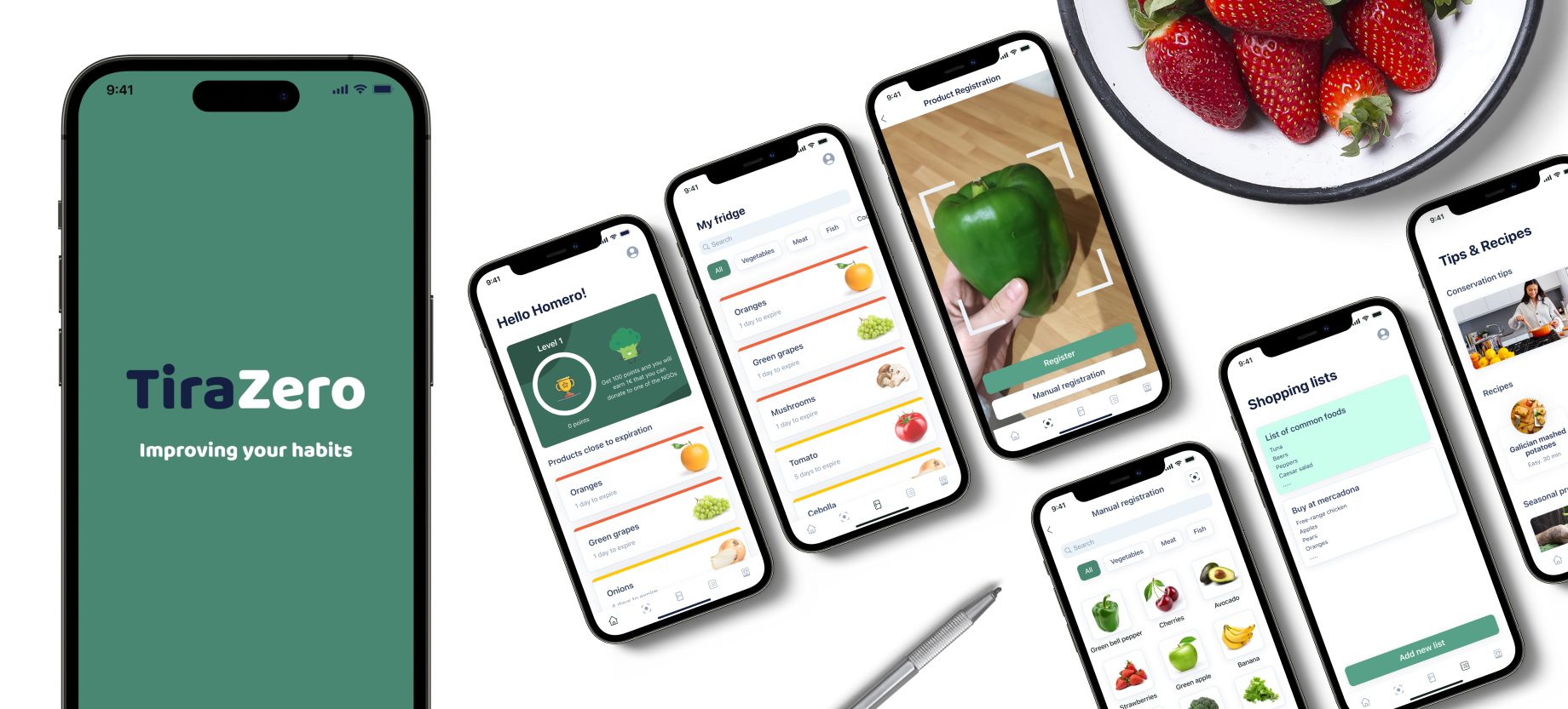
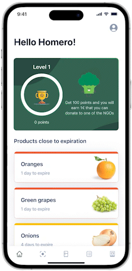
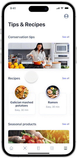
In this screen we will observe our "mascot" that will inform us about the points we have and when we can redeem these points in donations for certain NGOs.
It also helps us to know which foods are about to expire and recommended recipes with these foods, avoiding throwing them away.
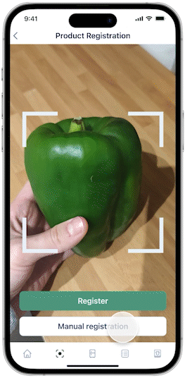
Thanks to artificial intelligence, it will be possible to recognize a product or a purchase receipt and add it to our refrigerator.
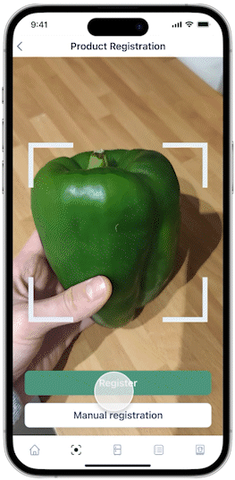
And if something goes wrong we will always have the possibility to add products manually.
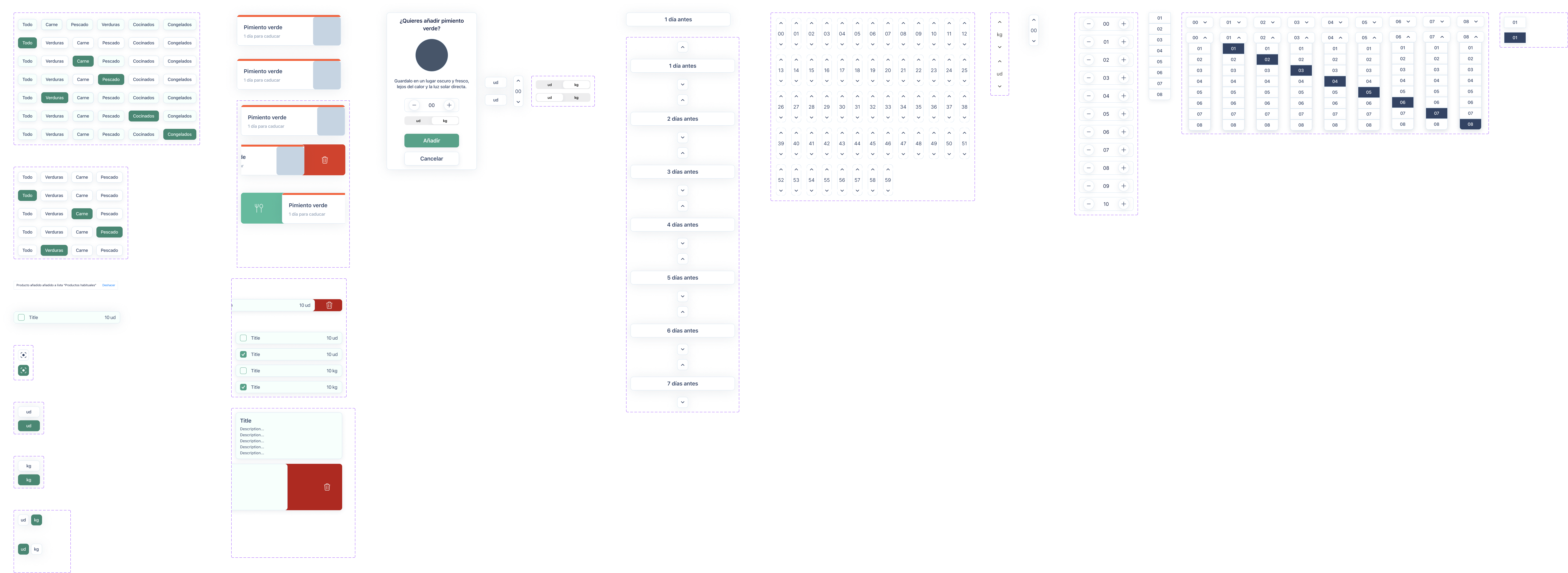
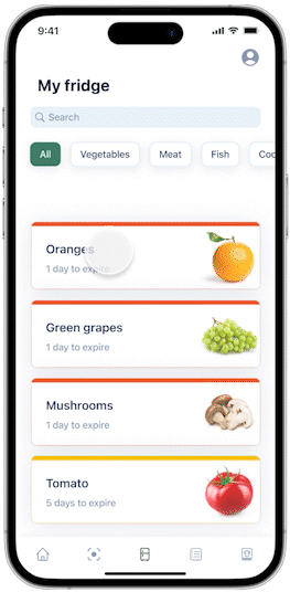
We will have classified the foods according to their category and thanks to a color code we will be able to know quickly which foods are close to expiring, being red for foods very close to expiring and yellow for foods that will soon be close to expiring.
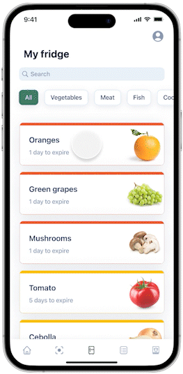
To be able to delete the products that we have had to throw away we have decided to integrate the swipe to the left, achieving an easy and intuitive result to perform this action.
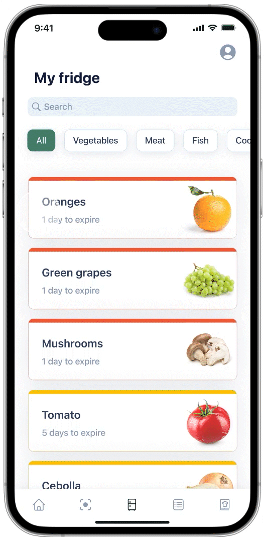
However, if we have eaten that food, the swipe should be made to the right.
In the tips and recipes section we can find three options: Conservation tips, recipes and seasonal products.
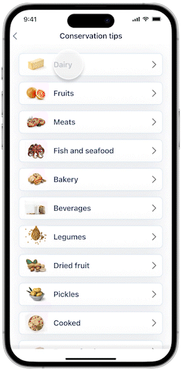
In the conservation section we will have filters for the food and we will find the most appropriate recommendations on how to conserve our food.
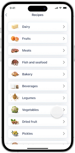
In the recipes we will also find filters depending on what kind of food we are looking for, all these recipes will be elaborated based on all the information collected from the food we have in "my fridge", making the most of all our food and avoiding waste.
In order for the application to show us which foods are in season, we will have to activate the location, so that it will show us which foods are in season where we are.

When working on an MVP, it can always be hard to draw a line in the sand when you feel so many features would boost the user's experience.
However, planning what a launchable MVP looks like allows you to focus on making the app's core experience as good as it can be, noting any feature ideas to be explored in the next phase.
Getting to be part of the process from conceptualization, strategy, & planning to final designs & direction, you really get to feel part of it, which I strive for with all projects.