Due to my interest in the field of videogames, I have decided to start analyzing some of them and to contribute my vision as an experience designer.

Because I am a regular player of this videogame and a ex player of the game (in real life) I have decided to analyze a bit and bring my vision of how the user experience could be improved.
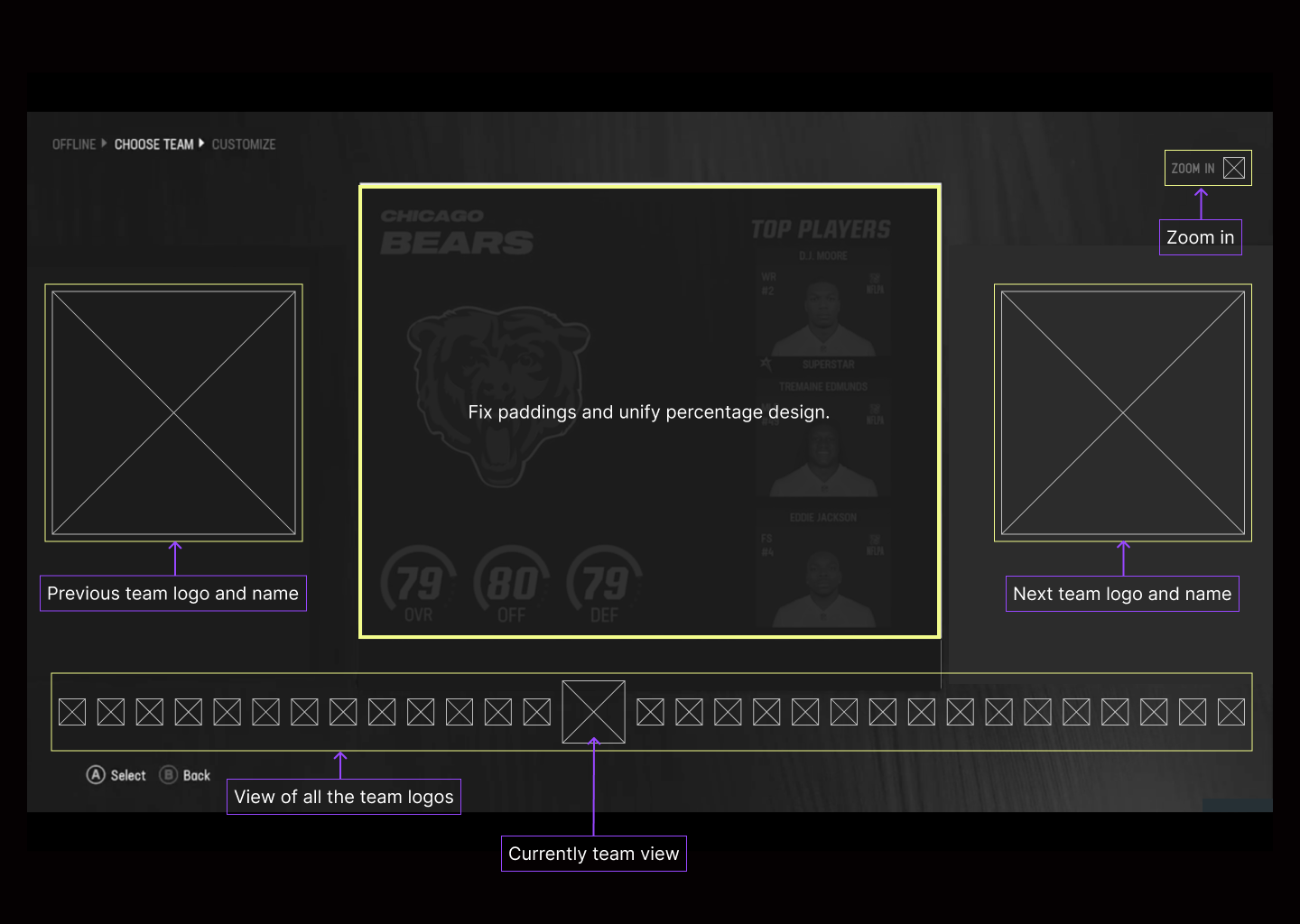
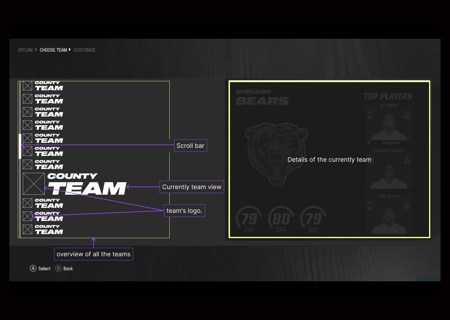
The analysis that I have carried out has been specifically in the ¨Franchise Mode¨ screen where we select the team we are interested in, we observe the team we have selected, the previous one and the next one.
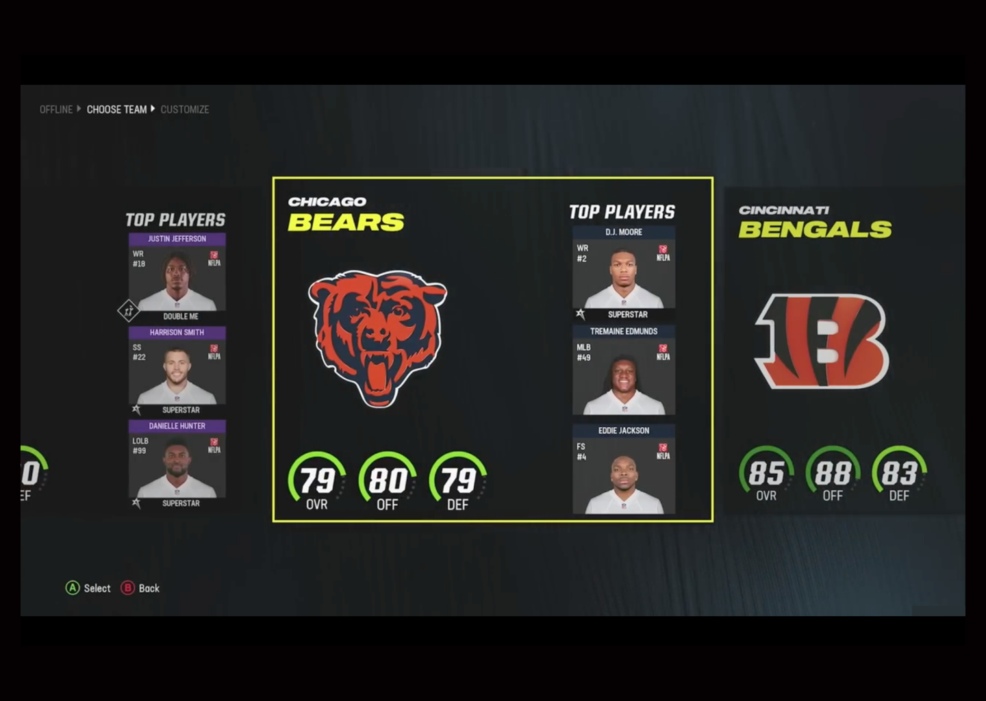
One of the proposals is to simplify the previous and next team in the logo and its name, making the user know at all times that the team is the previous and next, in addition to having a vision of all quipos (tab bar) and its order and know at all times where it is, making you do not have to go blindly to find a particular team.
Unify the percentages because if we are with right angles, the circumferences and their color (gray) are more difficult to distinguish and it does not seem that we can improve these qualities.
Also have the possibility to increase the size of the tab bar, being more accessible to more users who may have visibility problems.
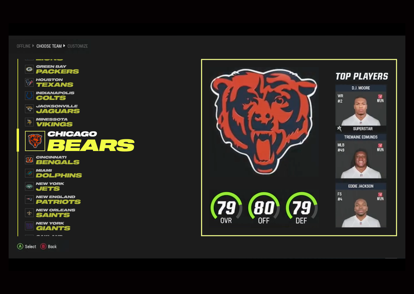
After selecting "zoom in" the icons of the teams are visibly much bigger and we will observe that a scrollbar appears indicating the position where we are located and letting the user know approximately how many teams are ahead or behind.
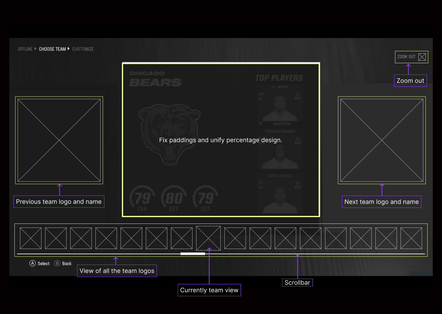
The left side will show the teams we have as a scrollbar, the team that is being displayed will be displayed on the right side and the team name will be removed since we have it on the left side and thus avoid repeating the name and zoom the details of the team.
In the scrollbar the selected team will change size and will be visibly much bigger than the rest and will have no opacity.
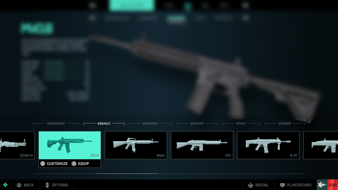
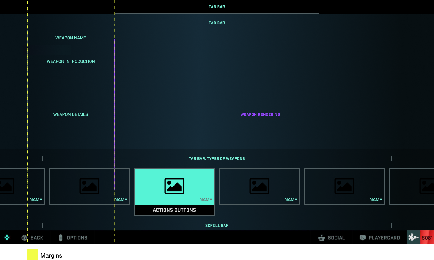
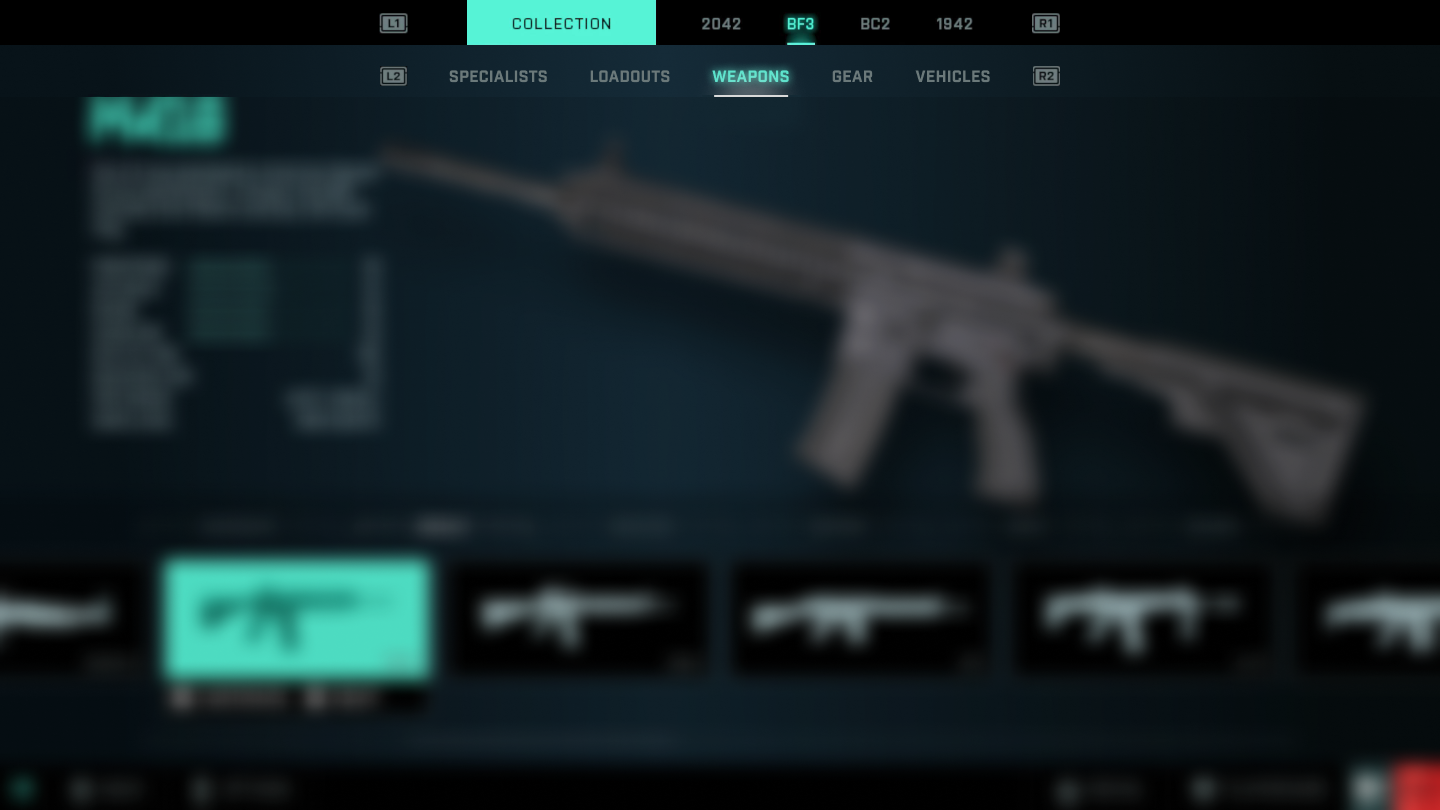
When we are in this screen, specifically in the selection of weapons.
We can see the amount of information so close together creates a bit of chaos and the user can become "overwhelmed".
Although we can have a glimpse of all available weapons, perhaps if we only show the type of weapon we are in we could take advantage of the images to be much larger and add the name of the weapon (very important detail, often players know the names).

It can be noticed that the tab bars have been aligned to the center for visual consistency.
The name, description and qualities are located in a single area, providing the user with all the information more easily.
Weapon selection and preview have been enlarged in size and the way they are displayed has been modified.
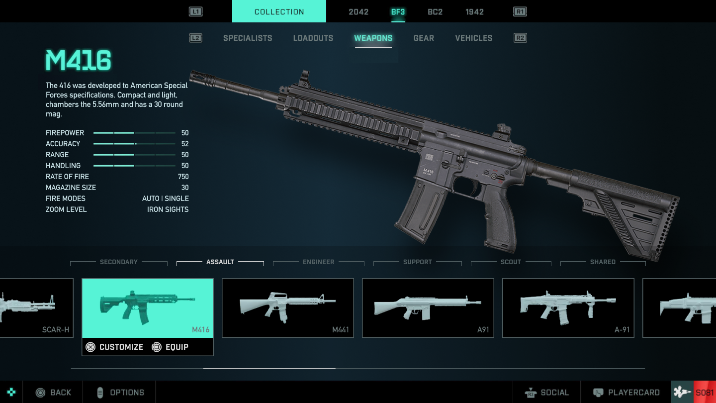
We note that the top tabs have been centered, achieving a visual consistency and that the user can locate everything much faster.
In addition, the action indicators for the L1 and R1 buttons have been moved, achieving visual consistency and making a reference to the playstation controller.
We note that on the left side we find the name of the weapon, then a brief description and finally the qualities.
Everything has been added in a single row, so that the user has a quick visualization of the necessary features in one part of the screen.
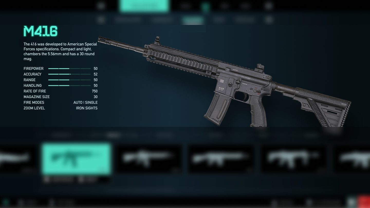
Finally we have a tab bar where we select the type of weapon and it will show us which ones we can choose within this one.
In addition to display changing the color of the selected tab we have been able to enlarge the size of the weapons and their names, reaching people with reduced visibility.
We will observe the weapon that we are seeing thanks to a color change and the possibility of customizing and equipping that weapon with the action buttons.We also have an indicator (scrollbar) that shows us if we have more weapons ahead or behind where we are.